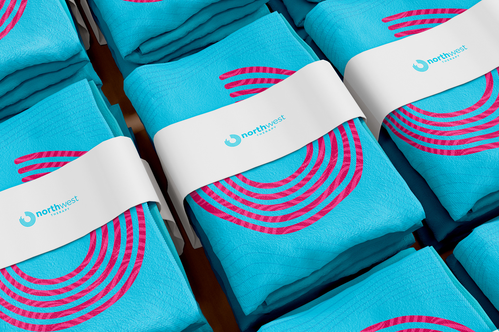
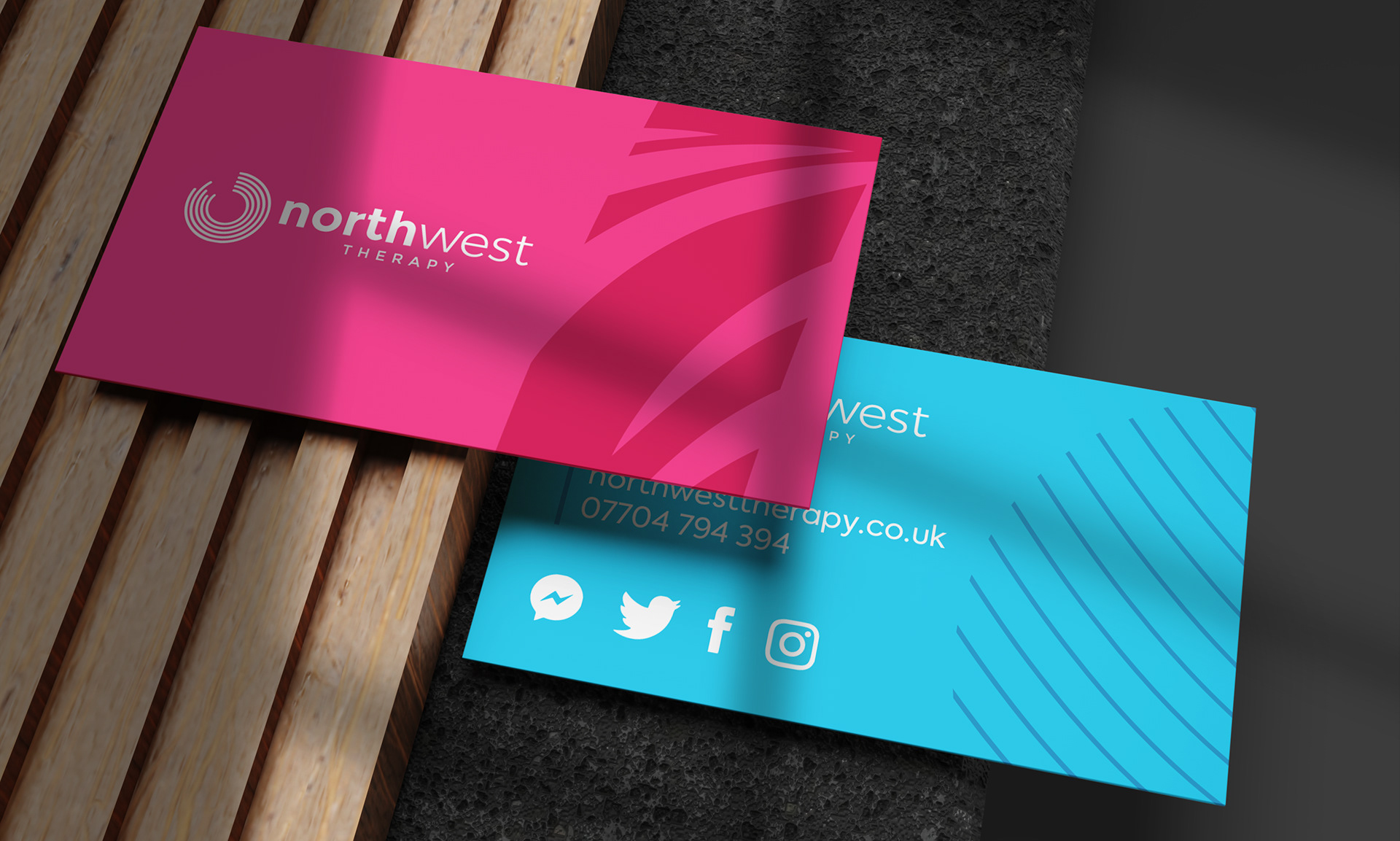
Branding | Web design | Social media assets and graphics
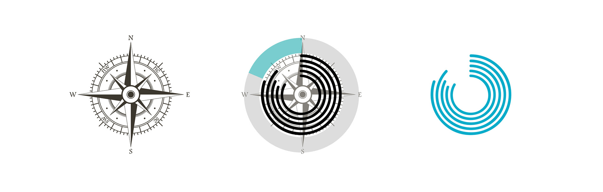
Northwest therapy is a sports therapy and rehabilitation centre based in the northwest of England, hence the name “North West Therapy”. The idea was to create a brand that represented the notion of treating a focused pain or issue. The circular icon is based on the focus or epicentere of where the pain originates from, as well as the negative space directing to the northwest location.
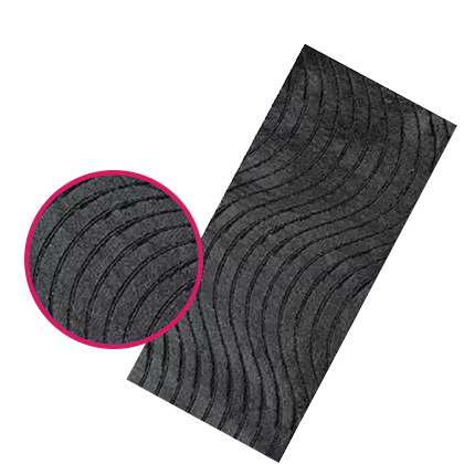
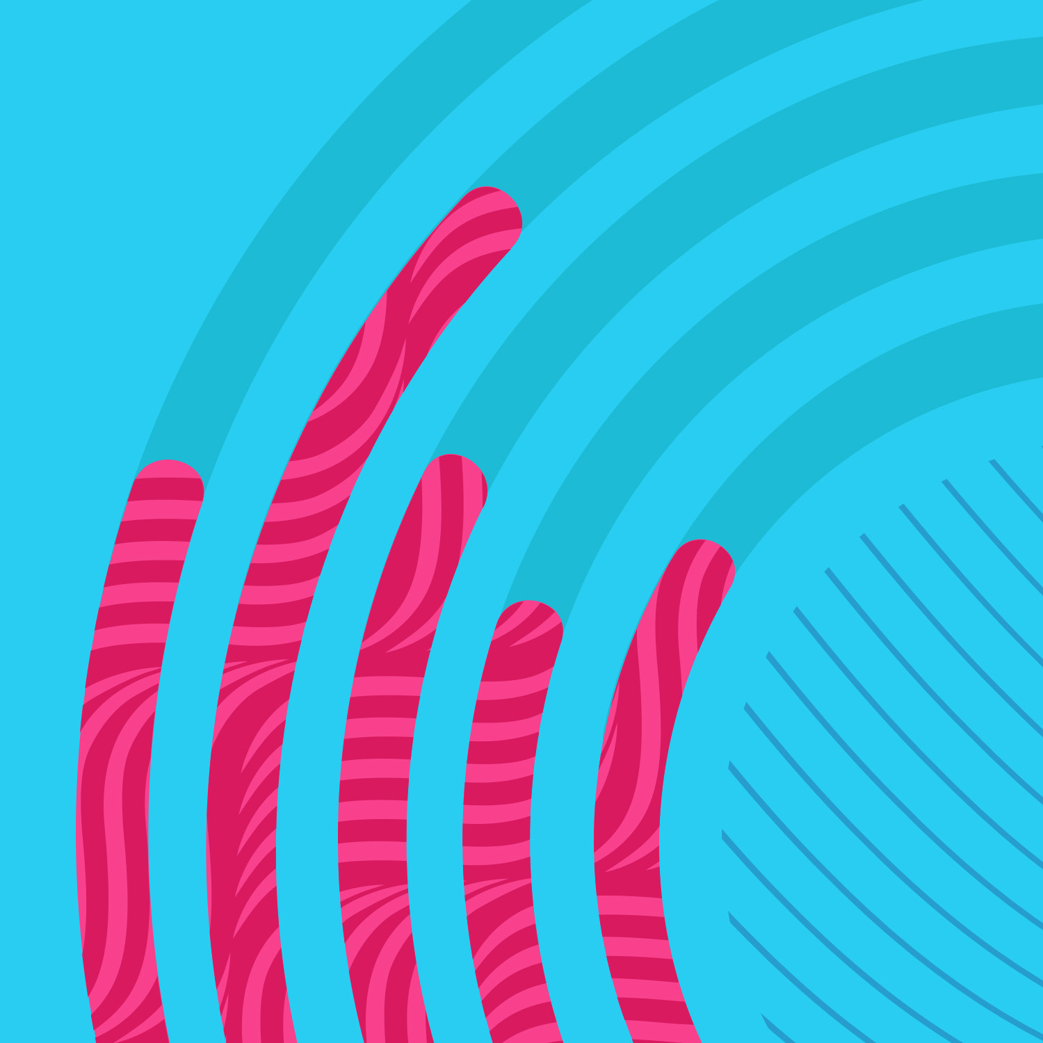
Inspired by Kinesiology Tape
The brand assets were inspired by the waveform adhesive which makes up the composition of Kinesiology tape commonly used to help rehabilitate sports injuries.