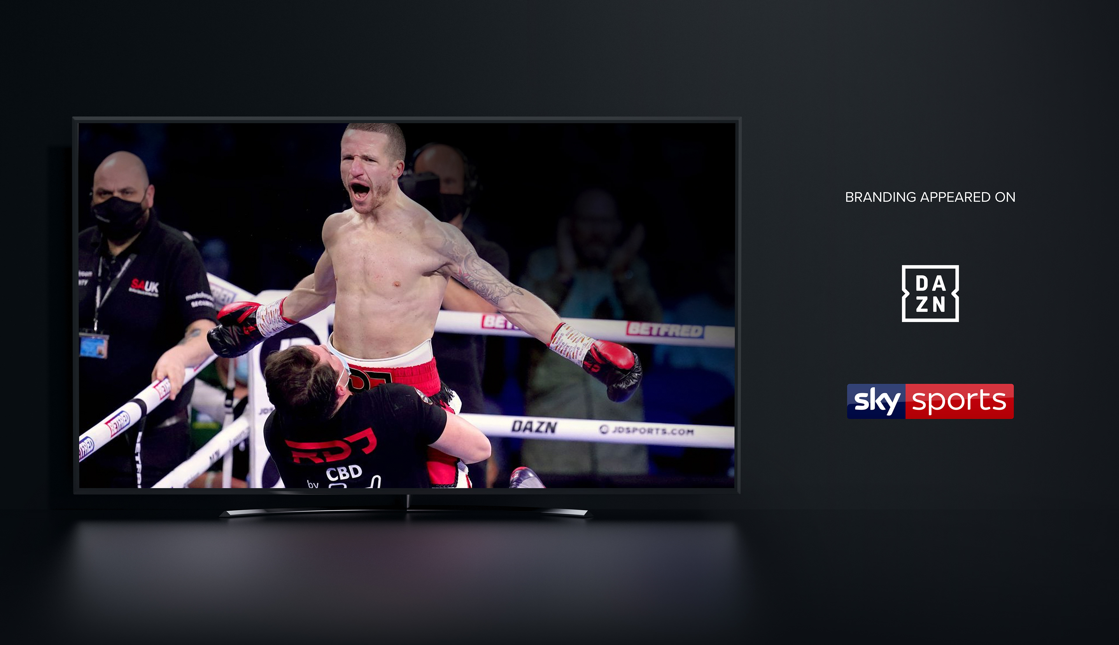
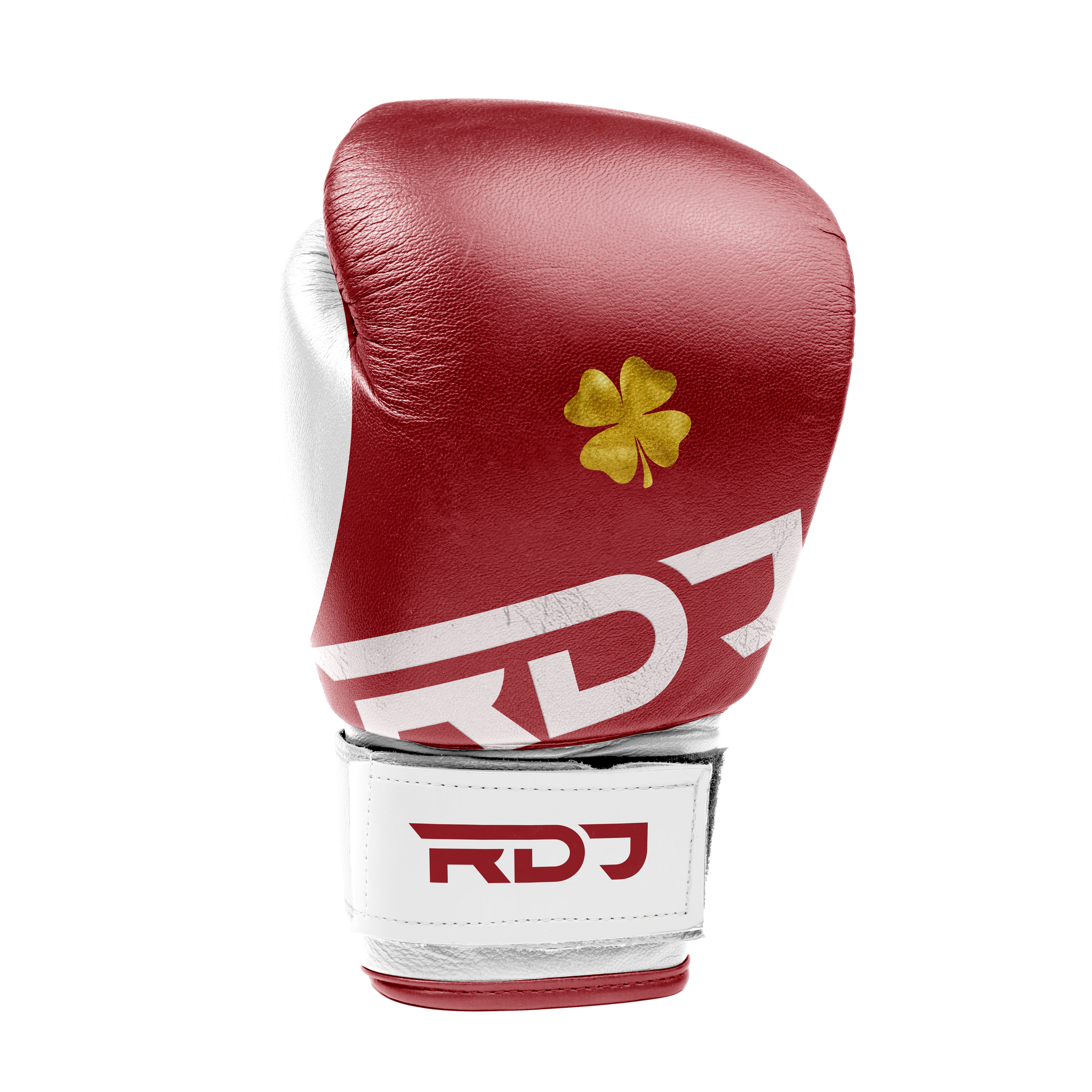
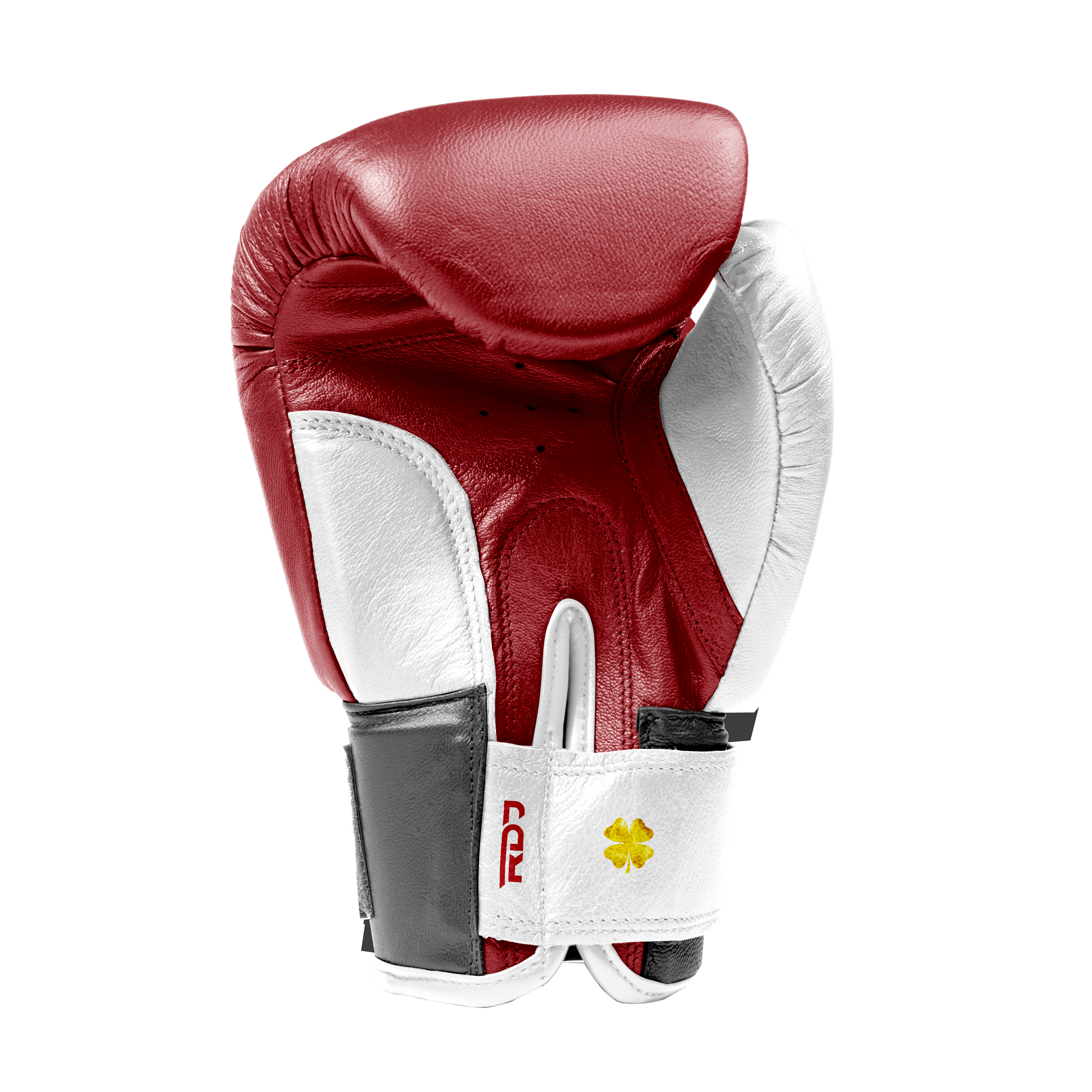
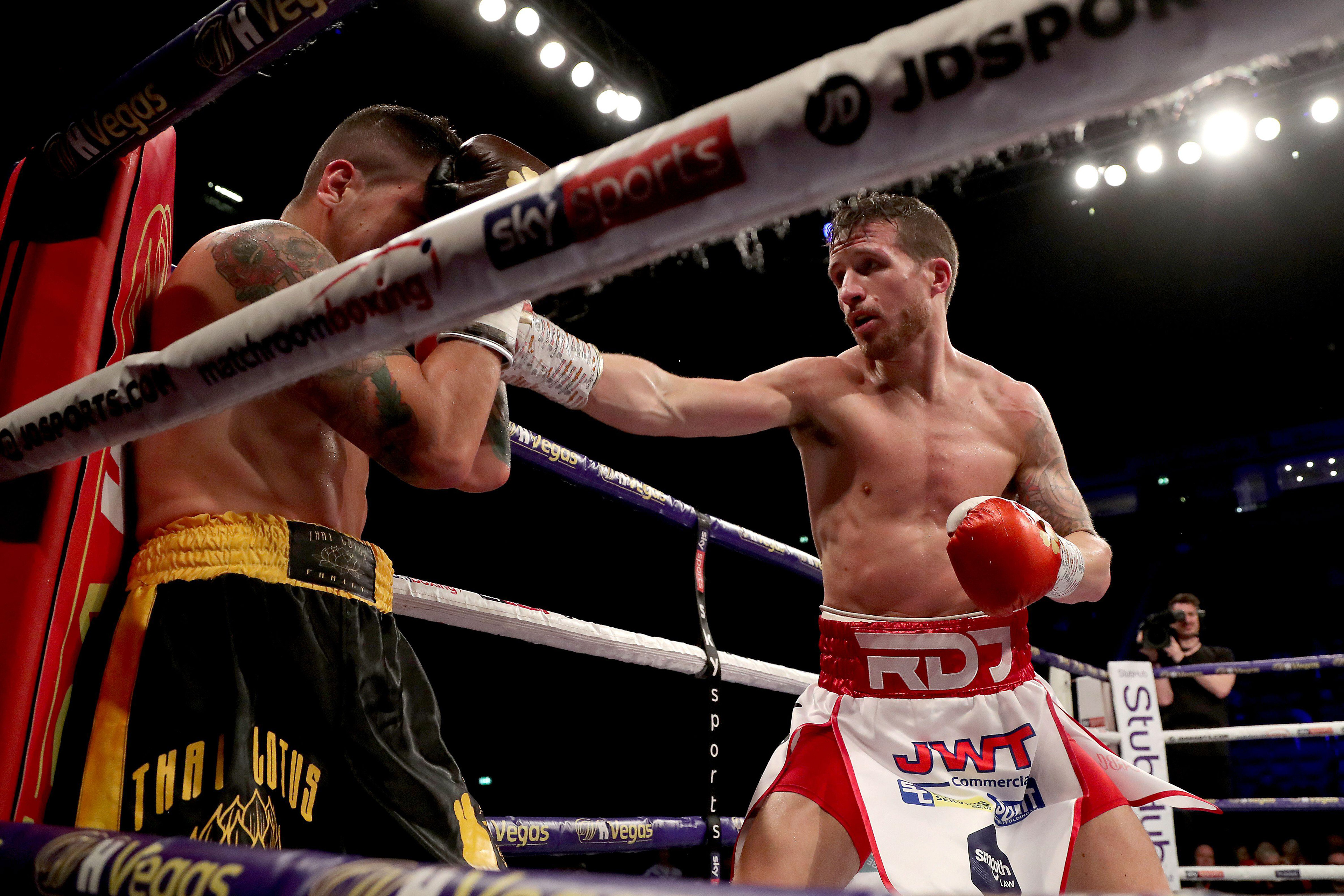
Branding | Apparel design | Brand management
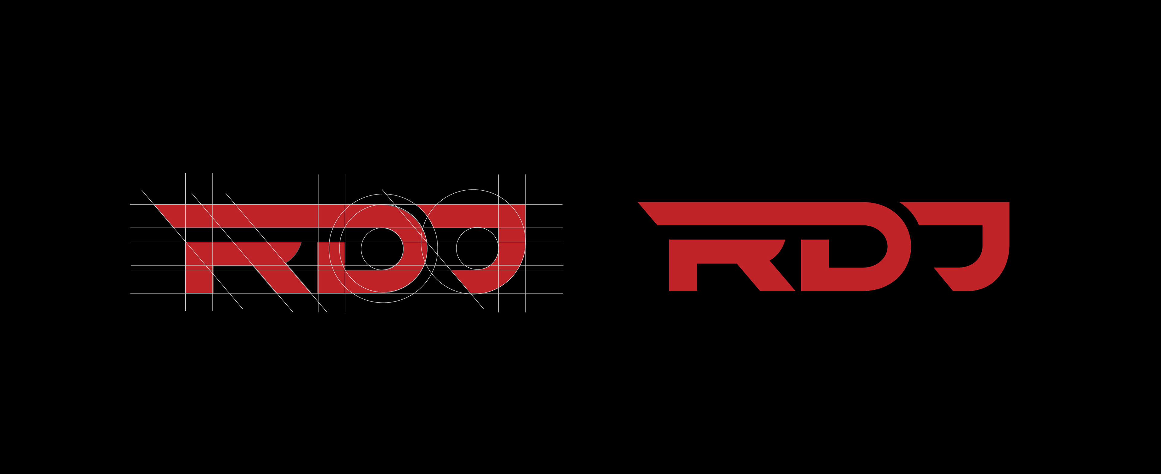
This logo was derived from a font. The kerning and spacing were planned out with guides, then adjusted slightly by mechanical and optical spacing to ensure the logo appeared correctly to the human eye. Adding clear space where the ascender begins created a sense of motion in the logo, which I felt was important for an elite athlete. The brand needed to represent Robbie Davies Junior - an elite athlete, at the top of their game. Super professional with an instant appeal to sports fans.